The Spotless Mind
Photoshop | Type Tool Basic Guide 본문

1. The Basics
Type is the Photoshop tool to create vector outlines and mathematical
shapes to define the symbols of a typeface. It’s located on the
standard Tool Bar as a tiny T. The keyboard shortcut of this is
the letter (T), and if you hold click over that tool (or Shift + T
several times) you’ll see four options: Horizontal Type, Vertical Type,
Horizontal Type Mask and Vertical Type Mask.
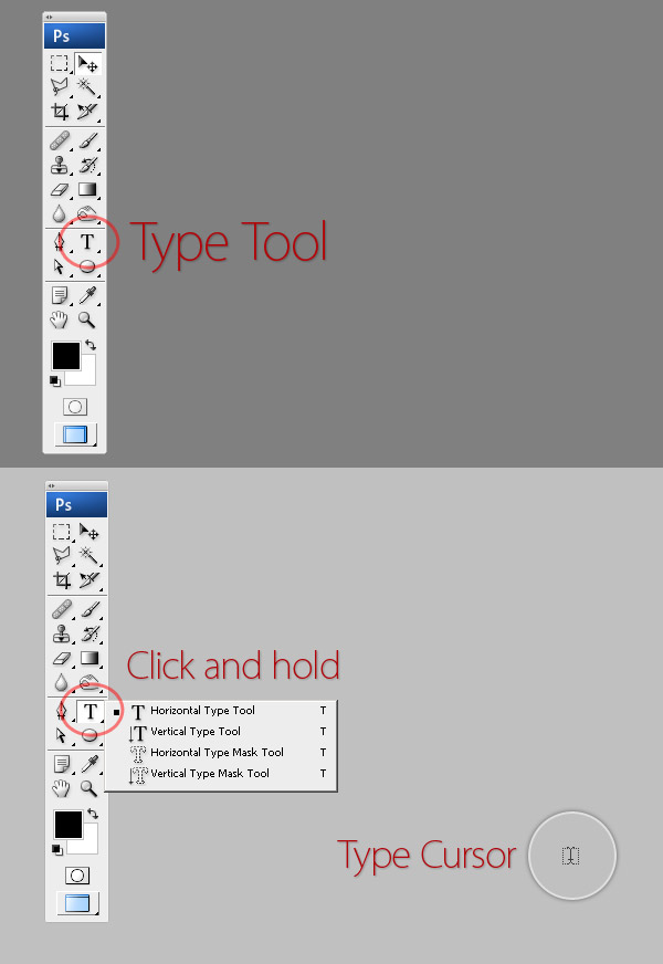
- Horizontal Type Tool: This enables the tool to create horizontal standard text (left to right and top to bottom).
- Vertical Type Tool: Enables the tool to create vertical text (top to bottom and right to left), useful to write in oriental languages like Japanese or Chinese, or if you want to experiment with typographic design.
- Horizontal Type Mask Tool, Vertical Type Mask Tool: Creates a Quick mask using the Type shape as a Selection. We’ll see more application of these modes shortly.
Once you’ve select your desired Type Tool, you’ll notice the mouse cursor changes into the standard Type cursor, something like an I, this means the document is ready to put text on it.
2. Creating a Type Layer
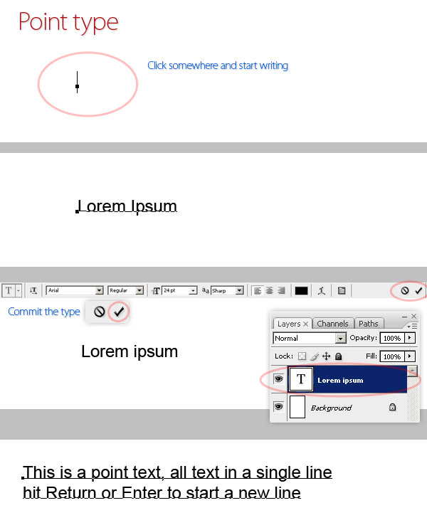
There’s two ways to create a text layer, which are Point and Paragraph Type:
- Point Type: This option will create a Type layer into a
single line, the break lines must be placed by you hitting Return or
Enter in the keyboard.
To create a Point Type layer select your desired Type Tool (Horizontal or Vertical text), and click one time with the cursor anywhere you want to put the text in. Then just start writing, when you have finished to add the text you can either click the tiny Commit button on the Option bar, hit the Enter key on the numeric pad of your keyboard or just hit Command + Enter.
- Paragraph Type: This option will create a Text layer with text wrapping into a bounding box. Is pretty useful for both print and web design. To add a Paragraph layer you must create the bounding box first. You can Click and Drag the cursor diagonally until you’ve got your desired size.
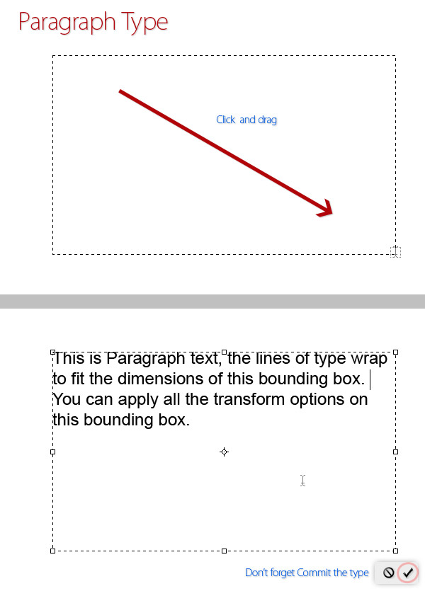
Doesn’t matter if there’s a background image, or any other object, the Type tool will create a new layer for the new text. Besides, you can easily switch between Point to Paragraph type or vice versa by going to Layer > Type > Convert to Paragraph Text / Convert to Point Text.
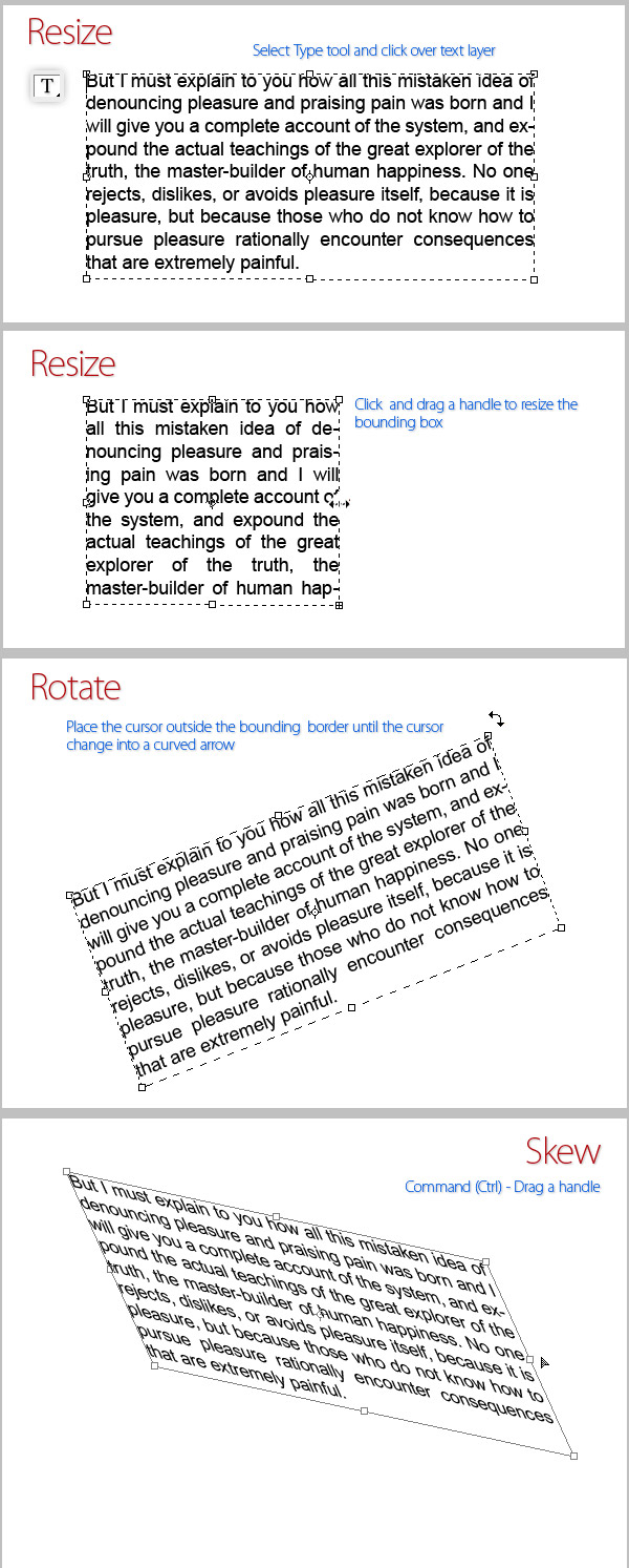
3. Resize and Transform
Obviously, you can resize and transform each text layer as any other, do it by using the Move Tool (V), selecting the layer and Showing Transform controls. Anyway this kind of transforming will stretch, enlarge, or badly distort the type shape.
If you really want a good result on a Paragraph Type layer, you must do the following: Select the Type tool, and click over the Paragraph text, then go to one of the transform handles and click and drag to resize the box, the text will automatically reflow inside the new box. Shift-drag to preserve the proportion or keep a constant rotation increment, Command-drag to scale the type, Command-drag on a center handle to skew the type box, and Option-drag to resize the box from its center.
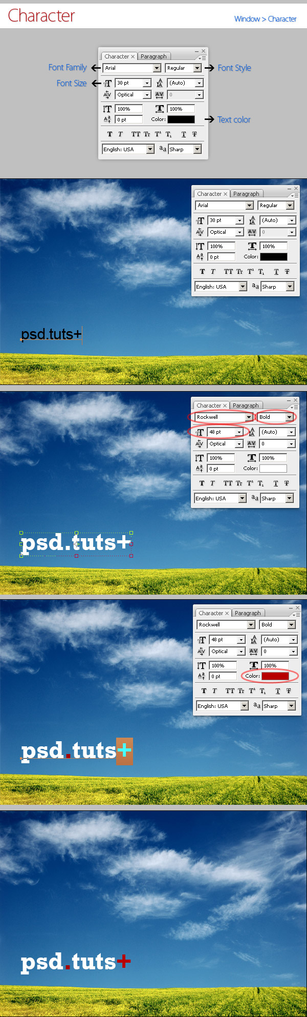
4. Character Options
Basic Formatting
It’s time to move forward. After typing some text, you obviously want to change the font face, color and more, this is really simple. First show the Character window by going to Window > Character. The Character window has several Options to format characters, following there’re some examples about formatting Font Family, Style, Size and Color (you must double-click on color sample to see the color picker). After committing the type, you can either click on the text miniature in the Layers panel and change the entire text layer format or with the Type tool selected, click on the text layer you want to edit, make a selection and change the character format of the selected text.
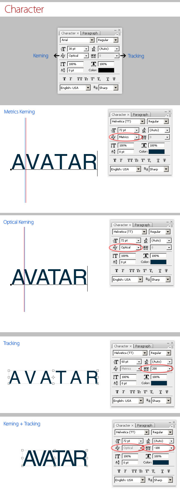
Kerning and Tracking
You can easily customize both Kerning and Tracking in Photoshop. Select a text layer or make a text selection and look in Character window for the Kern and Track values.
You’re able to customize the kern (space between specific pairs of characters) by selecting between Metrics Kerning or Optical Kerning. Metrics will automate adjust kern using the included pairs of the font you’re using. Optical will adjust the kern based on the font shape. Besides you can customize the kern values by typing a numeric value (positive or negative) in the Kerning field or select one of the presets.
Tracking is very similar, just set a numeric value (positive or negative) to increase / reduce space between the letters. Besides you can combine both Kern and Track to obtain a nice result.
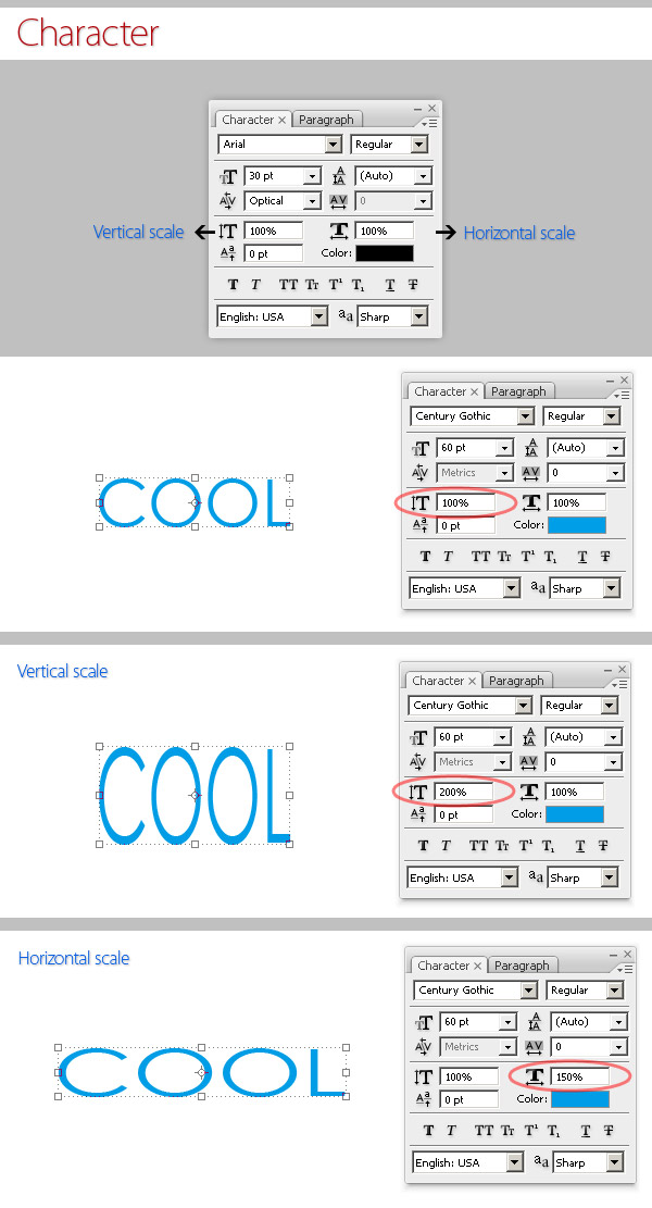
Vertical and Horizontal Scaling
Scale the text layer both horizontally and vertically by changing the Scale values in the Character window. Just as advice, I almost never use those scaling values because when you distort a typeface you’re distorting the shape itself, and sometimes creating an undesirable result, look at the image below, the nice Century Gothic’s ‘O’ character is a perfect circle without scaling it, and it turns into an oval when you change the scaling values. Besides notice the shapes aren’t regular, i.e. the line width is wider at top and bottom of the ‘O’ character when you change the vertical scaling.
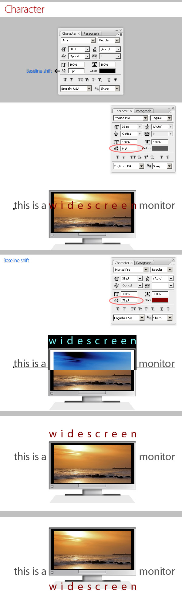
Baseline Shift
This is very useful when you want to make your text layer fit somewhere, such as around an image. Change this value to move the baseline of a text selection above or below the baseline of the rest of the text layer.
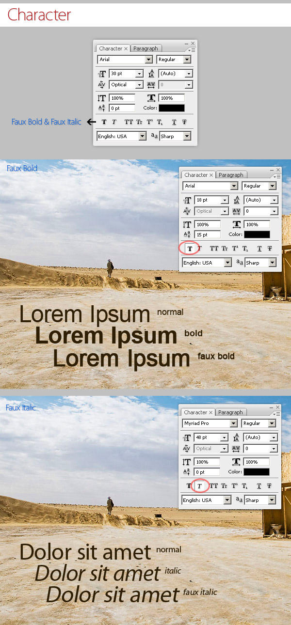
Faux Bold and Faux Italic
Photoshop has the option to auto create a Faux Bold and Italic variation for any typeface, pretty useful sometimes, but you must take special care in order to distort the type shape as little as possible. Below there are examples of Faux Bold on the Arial typeface, which isn’t distorting the type shape that much, but applying Faux Italic on Myriad Pro actually distorts the original italic style of the typeface (look at the ‘a’ character for example).
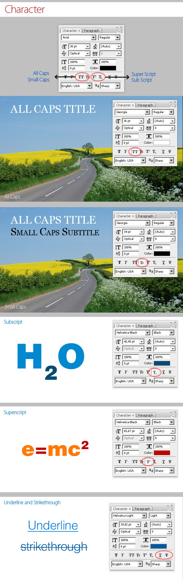
Font Variants and Text Decoration
You can easily customize the font variant, Capitalizing all the characters, or convert it to Small Caps. To do so, just select a text layer, or make a text selection, and click on the respective button in the Character Window. Besides, you can edit the text decoration as Underline or Strikethrough.
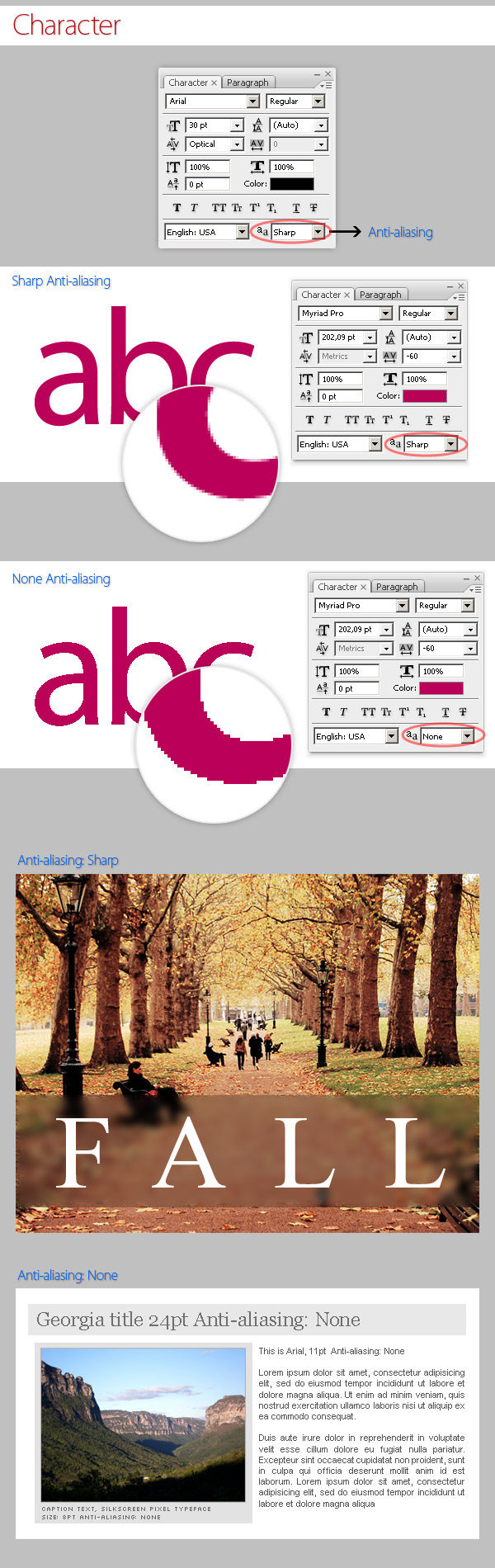
Anti-aliasing, Where and When
Anti-aliasing produces smooth-edged text making the text borders blend into the background layer/image. There’re four anti-aliasing options: Sharp, Crisp, Strong and Smooth, and obviously the option None. Often, you must apply some anti-aliasing to every text layer in your design for easily reading in particular into Serif typefaces. There’re some exceptions when you should set None as anti-aliasing value, i.e. when you’re adding sample text for web design content, when using a pixel typeface, etc.
Leading
Either in both Point or Paragraph text layer you can adjust the
leading (vertical space) between lines. Leave it as an automatic value
by selecting (auto) for the Leading value, or type a custom value to
adjust the space by yourself.

5. Paragraph Options
Basic Alignment
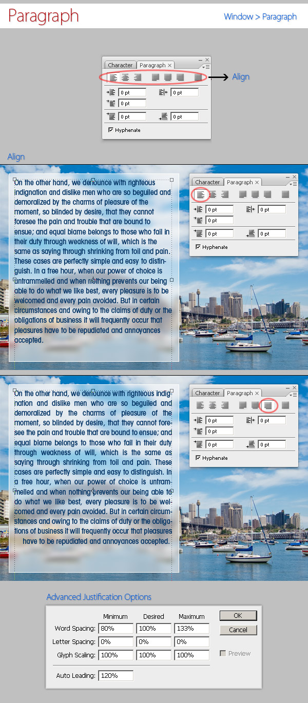
Since a Paragraph Text Layer can contain multiple lines, formatting them is very important for the quality of any design, that’s what the Paragraph window is about. Open it by going to Window > Paragraph. Create a paragraph text layer, type something, commit the text and click on the layer miniature to activate the options for the entire text. Alternatively, you can make a text selection by using the Type tool, and apply paragraph formatting only into the selected lines of your text layer.
Of course, the basic feature on Paragraph text is Align. You can easily customize the alignment (Left, Center, Right or Justify) by clicking on the icons in the Paragraph window, besides there are three more options for Justify Alignment, changing the alignment of the last line of the text layer or the selected text (Left, Center, Right).
To customize the Justify alignment, go to the Paragraph palette menu and click on Justification, there you’ll be able to configure Word and Letter Spacing, Glyph Scaling and Auto Leading percentages.
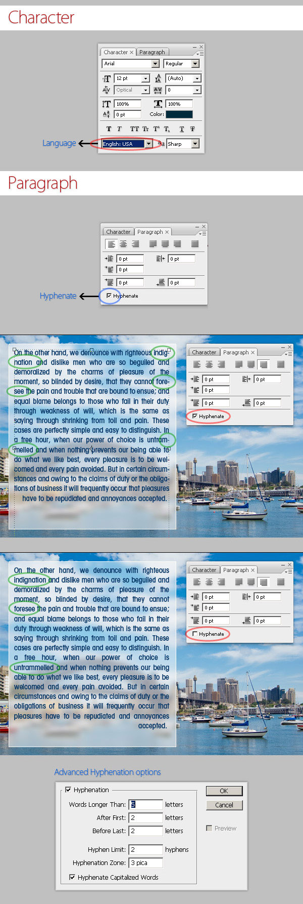
Hyphenation
The settings you choose for hyphenation affects the horizontal spacing of the paragraph, making it wider or stretching it, depending on the words of each line. To apply hyphenation into a Paragraph Text Layer, just choose the language in the Character Window, and activate Hyphenation in the Paragraph window. To disable Hyphenation, just uncheck the option box in the Paragraph window.
Most of time the automatic Hyphenation will work just fine for you, but sometimes you’ll need to customize it. To enable advanced Hyphenation options click on the Paragraph panel menu and select Hyphenation. You’ll see the following options:
- Words Longer Than # Letters: set the minimum number of characters for your hyphenated words; i.e. if you set a value of 5, the word ‘photo’ will be not hyphenate, but if you set the value ’3′ you’ll get ‘pho-to.’ The default value is ’2.’
- After First # Letters and Before Last # Letters: specifies the minimum number of characters at the beginning or end of a word that can be broken by a hyphen, i.e. if you set any of those values as ’1′ you could have an undesirable hyphenation, such as "h-ello" or "actio-n." By default both values are set as ’2.’
- Hyphen Limit: set the maximum number of consecutive lines on which hyphenation may occur.
- Hyphenation Zone: set a distance from the right edge of a paragraph.
- Hyphenate Capitalized Words: prevents hyphenation of capitalized words.
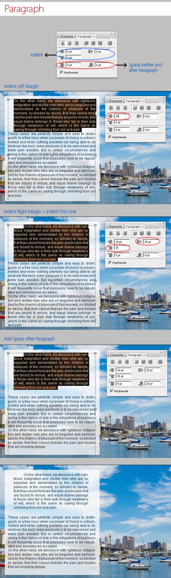
Indent and Space Between Paragraphs
Indenting is quite easy. Just select a text layer, or make a text selection, and write or slice both left or right Indent values. You can indent a text selection left or right, or indent the first line of a Paragraph as shown in the second image below.
Besides, you can easily add space between paragraphs (before or after) in the Paragraph window, just type a custom value in the Space Before or the Space After paragraph.
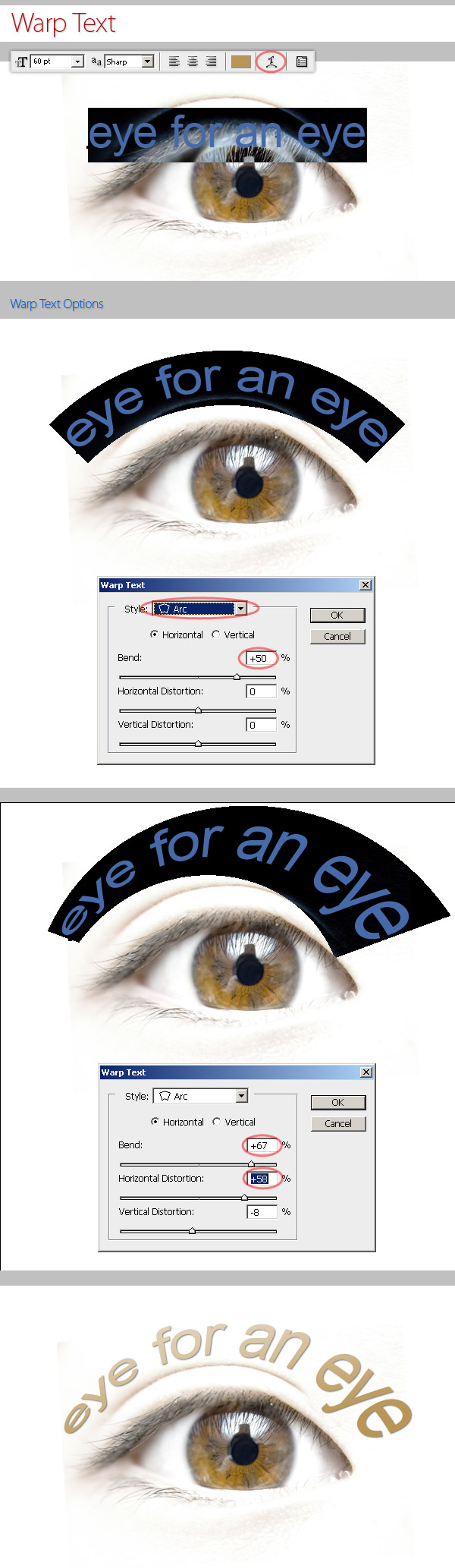
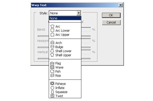
Warp Text
One of the most powerful features of the Type Tool is the capability to Warp any text layer according to your particular needs. To Warp a type layer double-click on the Text Layer Miniature and click over the Create Warped Text button in the Options Menu. You’ll be prompted to select a Warp Style orientation (Vertical or Horizontal), then you’ll have three sliders to increase or decrease the values of Bend, Horizontal and Vertical Distortion. Below is a single example of how to warp Point text by using Arc Warp and different values of Bend and Distortion.
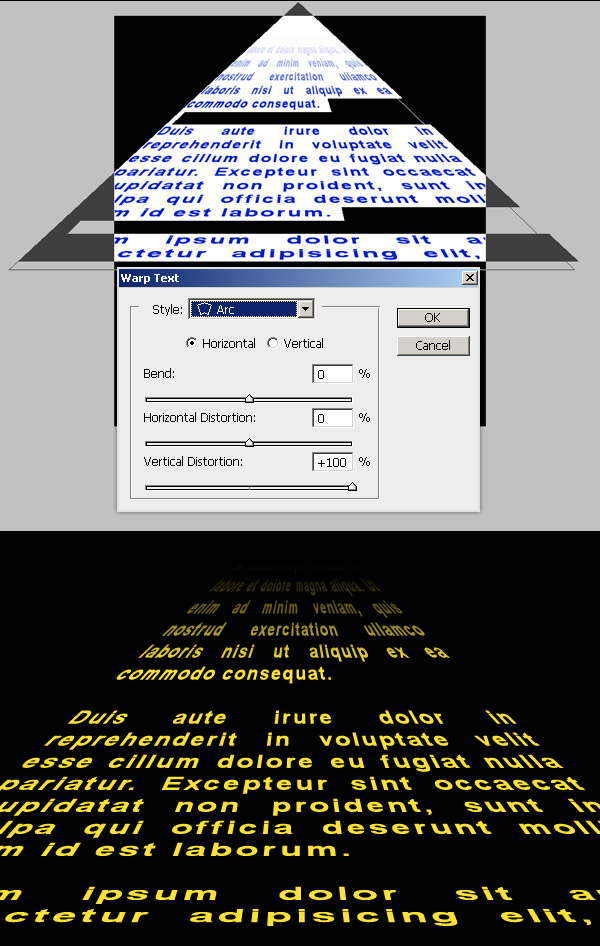
Of course you can Warp a Paragraph Text Layer as well, see the image below. It shows a simple way to get the famous “Star Wars” intro effect just by increasing the Vertical Distortion and with the help of a small Gradient Layer Mask.
Warping text is really funny, try it with different warp options. There’re a few restrictions though, you cannot Warp a Text Layer if you applied previously Faux Bold, or Faux Italic styles in the Character panel.
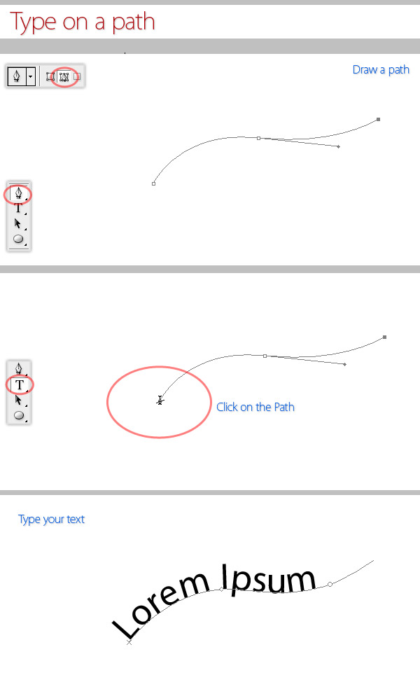
Type on a Path
You can create a type layer that flows along a work path created by using the Pen Tool or Vector Shape Tool. To create a Type on a path, first draw a path by using the Pen Tool, then select the Type Tool and place the cursor anywhere on the path, you’ll see the shape of the cursor changes the baseline for an S shaped line. Click on the path and write some text.
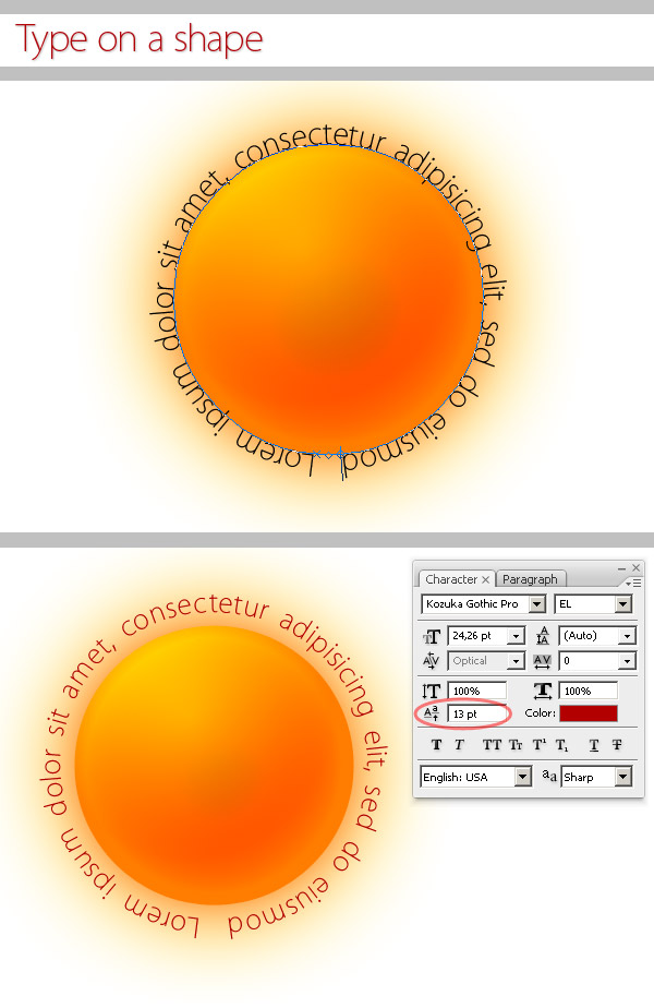
Path on a Shape
The process to add a text layer on a vector shape is the same. First, ensure the vector shapes is selected, do this by using the Path Selection Tool to select the shape. Once the path is visible, select the Type Tool and click anywhere over the path and write something. You can edit any Character option, a good example is increasing the Baseline Shift a little bit to create a space between text and shape.
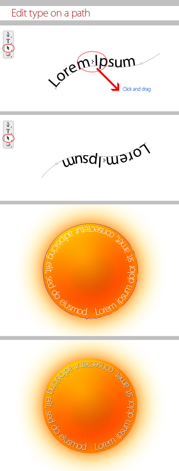
Edit Type on a Path
Sometimes you’ll need to change the orientation and position of the type on a path. For this, select the Path Selection Tool, place the cursor over the text until you get a little black arrow on the type cursor, then Drag the cursor below the baseline to flip the type. Use the same method to flip the text and place it inside a shape. Obviously, you can add any layer style to the text layer and this will continue being editable.
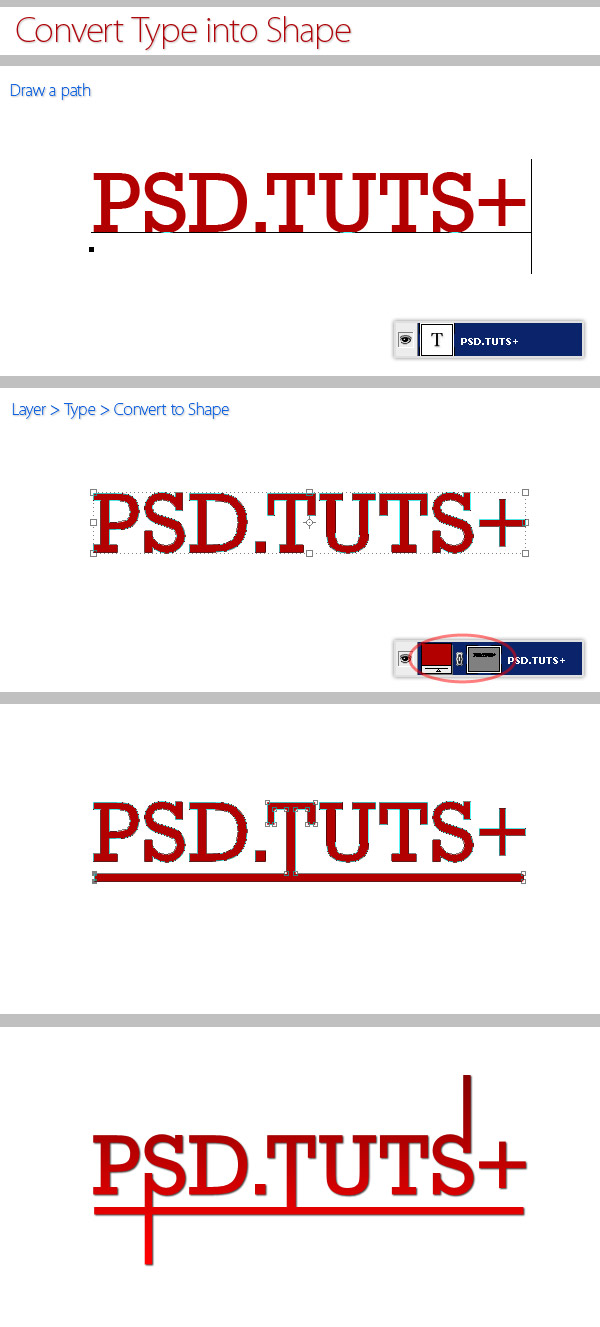
Convert Type into Shape
Several times we’ll need to be able to change or modify the shape of a character, for several purposes, like logo design, Photoshop makes this easy. Just create a text layer or select one and go to Layer > Type > Convert to Shape. This tool will convert the type into a Vector Layer Mask, which can be edited as any other vector shape. You can also create a Work path by going to Layer > Type > Convert Work Path.
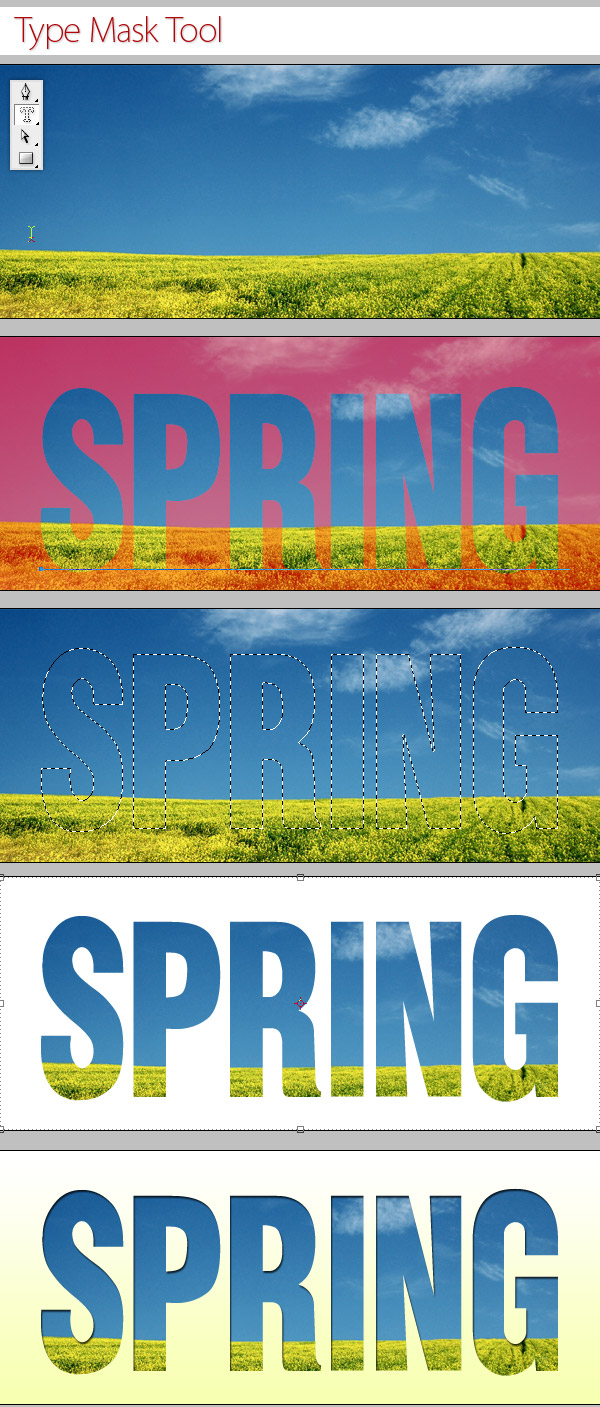
Type Mask Tool
Finally, you can do most of the described features of the type tool, but using Selections instead type shapes. For this click and hold on the Type Tool until more options appears. There select Horizontal (or Vertical) Type Mask. By selecting this tool you’ll be able to create a quick selection with the shape, which is pretty useful on either Layer Mask or Quick Mask mode. Below is a small example of a word written using the Type Mask Tool. I used that selection to create a Layer Mask over a picture.
6. Conclusion
Type tool is one of the most powerful features of Photoshop. With practice you’ll become a master after playing with characters and paragraphs. There are no limits of what you can create with this wonderful tool.
Subscribe to the Psdtuts+ RSS Feed for the best Photoshop tuts and articles on the web.'DESIGN Factory > 글/스크랩' 카테고리의 다른 글
| 효율 좋은 구글 관리자의 8가지 습관 (0) | 2011.06.06 |
|---|---|
| Flash Develop 단축키 (0) | 2011.02.22 |
| 절제와 풍요 - 덴마크의 예술과 디자인 展 (2) | 2007.11.11 |
| FTA, 얻은 게 더 많다고 좋아하는 그들만의 철없는 자신감이다. (12) | 2007.04.03 |
| ‘키치’란 말의 뜻은 뭔가요? (0) | 2007.03.30 |